First steps of using googleVis on shiny
animation
,
googleVis
,
gvisGeoChart
,
gvisScatterChart
,
gvisTable
,
map
,
R
,
RStudio
,
shiny
,
Tutorials
29 comments

However, before we upload the next version of googleVis to CRAN we decided to present a preview of version 0.4.0 here, asking for feedback. It would not be fair on the guys behind CRAN to release something into the wild, only to be told by users within a few days that we missed something. Hence, you can get the new version of googleVis only from the download page of our project site for the time being.
You may have read the post on RStudio's blog that the shiny API changed slightly: the
reactivePlot and reactiveText functions have been renamed to renderPlot and renderText with simplified input parameters. Thanks to Joe, there is now also a renderGvis function as part of the googleVis package, which works in very much the same way as the other two. To run the following examples you need shiny version 0.4.0 and googleVis version 0.4.0 or higher.
Example 1: Select data for a scatter chart
In this example the user can select different data to be displayed via a scatter chart. I use therenderGvis function in the same way as I would use renderPlot or renderText.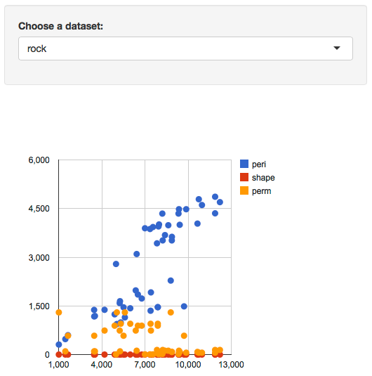
You can run the app locally via:
library(googleVis)
library(shiny)
runGist(4970975)
Example 2: Interactive table
The second example is quite simple as well, it displays a table. However, I am using the Google Chart table, which means that I can make it pageable and allow the user to choose how many rows of data to be shown. Of course, columns can be sorted by clicking in the header. I am not aware of any other option in R to create interactive tables.
You can run the app locally via:
library(googleVis)
library(shiny)
runGist("eda98b0dfdaec284f271")
Example 3: Animated geo chart
The third example plots the results of the US presidential elections from 1932 - 2012 as a geo chart, showing the share of democratic votes by state.I use a
slidebarPanel to enable users to browse the data. The really clever bit is that the function slideInput has an argument animate, which when set to TRUE, allows the user to animate the geo chart. Hit the play button in the bottom right hand side of the slider panel.
You can run the app locally via:
library(googleVis)
library(shiny)
runGist(4642963)
Conclusions
Finally, with version 0.4.0 of googleVis and shiny, both packages have found together. I think, this marks a big step forward for both projects as it becomes even easier to develop true interactive data analysis applications for the web using the power of R in the background.We will be most curious to see how you use the two packages combined for your work. Please let us know how you have used googleVis with shiny, e.g. via a comment below with a link to your app, or send us your feedback via email and/or file issues on our project site.
As mentioned above the apps of this post are hosted on RStudio's server, as part of their shiny beta testing programme. Thanks to RStudio again.
Further changes in googleVis 0.4.0
- In order to support shiny the order of the elements of the
gvis*()$html$chart vector changed. The positions of jsChart and
jsFooter have been swapped.
- The load mechanism for the Google API changed from http to https
again. Thanks to Jacques Philip.
- The package dependencies changed to imports statements in DESCRIPTION.
Thanks to Suraj Gupta for pointing this out.
- The R.rsp example in demo googleVis has been moved into its own demo Rrsp.
- A FAQ and shiny section has been added to the vignette.
Bug Fixes
- jsDisplayChart didn't check if the google visualization function is already
loaded. Many thanks to Mark Melling for reporting the issue and
providing a solution.
- The demo WorldBank didn't download all data but only the first 12000 records. Many thanks to John Maindonald reporting this issue.
Session Info
R version 2.15.2 (2012-10-26)
Platform: x86_64-apple-darwin9.8.0/x86_64 (64-bit)

locale:
[1] en_GB.UTF-8/en_GB.UTF-8/en_GB.UTF-8/C/en_GB.UTF-8/en_GB.UTF-8

attached base packages:
[1] stats     graphics  grDevices utils     datasets  methods   base

other attached packages:
[1] shiny_0.4.0     googleVis_0.4.0

loaded via a namespace (and not attached):
[1] bitops_1.0-4.2   caTools_1.14     digest_0.6.1     RJSONIO_1.0-1    websockets_1.1.7 xtable_1.7-0


29 comments :
This looks great! thank you.
One question though. Is it possible to use googleVis in corporate work. Don't you have any issues arising from with google's IP ?
Have you read the Google Terms of Service https://developers.google.com/terms/?
I suggest you discuss this issue with your colleagues in IT / Legal and if in doubt contact Google directly. Those concerns can usually be resolved.
Again, great work on this update!
As you know Markus, this is just what I was looking for. Here are a couple of examples I have posted
http://glimmer.rstudio.com/pssguy/eplTableMotion/
http://glimmer.rstudio.com/pssguy/storesMap/
This looks great! I believe you are displaying weekly data in your motion chart, rather than the year 1901 onwards. Figures less than 100 will be interpreted as years between 1901 and 1999. However, the motion chart supports weekly data; see the example in the help file.
That is a great work. Would you please share the codes you used for the Charts?
The code can be found here
https://gist.github.com/pssguy/5059329
I have not provided the actual data so you cannot use runapp on it to see the charts
It is not strictly weekly data.It is done by game sequence so the x axis is an integer. Can i still get rdi of the 1900. It is misleading?
Hi Markus, i tried out the new version on an old code which uses "knitr" and "googleVis" (not shiny) to produce an html report. It seems that, for some reasons, 0.4.0 has an issue that 0.3.3 does not: some gvis plots (gvisBarChart, in particular) don't always show up in the output html, keep refreshing the page may get it from time to time, but totally unpredictable when. Any ideas? Thanks!
Thanks for your comment. Can you please send me a little example via email. Cheers
Markus
Just sent to your gmail, thanks!
How do you actually import your own data for the scatter charts for example?
This is really good stuff. Thanks
Similar as to the other two examples here. Once your data is in R's memory you can use it with shiny. See the R Data Import/Export manual for more details: http://cran.r-project.org/doc/manuals/r-release/R-data.html
Hi Markus,
I know how to read in the data as csv etc, but I do not know the format it has to be in, in order to run this app. You know what I mean?
This is top notch though, great work, very impressed
I hope the documentation and examples of gvisScatterChart give you enough information to replicate an app with your own data.
Thanks for the great work. Does anyone know why the figure for the District of Columbia (DC) is not shown on the animated geo chart ?
Is it possible to make the chart bigger? Like extends right further with the web browser itself? (gvislinechart)
I suppose you would have to set the width and height options dynamically. See here: http://stackoverflow.com/questions/8950761/google-chart-redraw-scale-with-window-resize. However, this is not built into googleVis yet and I wouldn't know how without help.
Great post Markus, thank you for your contribution to the R community. Shiny keeps getting better.
Hi.
I have one doubt. In the first example, how do you introduce the data that it uses?
Thanks
It is part of the example datasets that come with R when you open it.
Ok. Could you tell me what i have to do if i would like to use another data that i have in .csv?
Thanks
See example 3 above, which uses read.csv. For further details consult the shiny and R documentation.
Great work Markus. How did you create this post with the examples live?
Jen, the examples are hosted on Rstudio's servers, e.g. example 1 is here: http://glimmer.rstudio.com/mages/Example_1/ and are embedded into the post via an iframe tag. I hope this helps.
Markus
Thanks much Markus for the information.
How about the live examples in the tutorial slides. http://decastillo.github.io/googleVis_Tutorial/
How were the slides made?
Not sure if it is possible to share with the group your slide code?
The first slide has a download button in the top right corner. I hope this helps.
I have a basic idea of how I can rJava and bring data from a JVM. But this data is streaming to the shiny server. The reactive RxJava can be used for this.
But the graphs are going to change partially when new data arrives. These could be moving charts. Can R's graph libraries display dynamic charts ?
Very cool stuff. Works wonderfully on desktop browser. Any idea why the charts won't show up in mobile browser. I am using iPhone 5 chrome browser.
Post a Comment